Hi,
I think Block background color (Not just title tab) would help contextualize elements we directly look at, especially when the block is long.
Same thing with lanes.
What I have in mind is not necessarily strong saturated colors (If someone fears the Christmass tree risk), but very unsaturated colors (almost white) because colored surfaces, rather than thin fonts, would allow seeing faded color differences, such as yellow, off white, a little green white, a little orange white, a little blue white, etc.
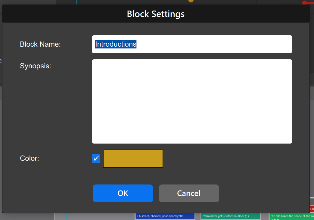
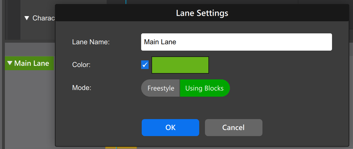
Block and lane labels need visible text, so their background collor need to be saturated.
This means for background, we would need a different saturation than for the label, ideally of the same color.
The other possible color type is those very dark: Dark blue, dark green, etc. (Not those very bright)
If one fears to much color at same time, the system would already have the whashed (unsaturated) version of the label color assigned to the lane, but users could enable or desable it. We could choose which lane is background lit: 1, 2, 3, or all of them, according to both our needs and preferences.
Hi,
I largely agree with this suggestion.
The underlying need is a sense of geography. In that regard, it doesn’t really matter what the colors are or how they’re used, as long as they create a sense of “place”, so you know quickly that you’re in the yellow’ish area.
The main reason this feature has been paused is uncertainty about whether color should be used horizontally or vertically. There’s a similar suggestion to give sections color, which colors the whole whiteboard with some light background tint that gives part of the background different colors so you can see where you are.
In my view, coloring lanes and blocks is more useful than coloring entire sections, because once you’re colored a section, you’re really not any more information to it, now you just have a purple part of the script, and you’ve used up your coloring capacity.
Coloring blocks and lanes would still achieve the goal of creating geography.
Incidentally, blocks and lanes already have colors. They’re just only represented in the title bar of the block/lane right now. This could be expanded to lightly tint the background of the block itself as well.
The other reason we’ve been holding off on color is that with the synced data model, we finally get the ability to import media, i.e. pictures, videos, whatever. If the whiteboard allows you to put in all your brainstorming, the question is, do you still actually need color?
Bottom line, I’d like to try expanding block/lane coloring to also do 20% of the color to the background.
As I said, DARK colors can also be not too much anoying or noticeable, but still help the same way as multiple almost white colors.
So far, to know in which lane we are in, we need to many times move our eyes to top left corner and be back to where we were.
We could:
Have a watermark appear in the lane, when the selected beat is in that lane, or while mouse is hovering that lane.
Have a small watermark that repeats every while, so we know in what lane we are.
Visually, would it be enoying if all watermarks of all lanes would repeat at the same place, making a vertical stack of watermarks, or if they should be dephased. We just need 1 to 2 per lane, on the screen.
Mark,
We’re happy to try coloring the backgrounds of blocks and lanes with a slight tint, but again, these ideas are bulldozers. We’re now even talking about watermarks in the background like a 90s website. This has gone off the rails.
I don’t think this is the right app for you. The app is very far away from your ideal app, and the proposals are again to add even more complexity dimensions when we have too many. All our work goes into removing dimensions, so you proposing to add what appears to be 5-10 new dimensions is just a non-starter. I don’t want to spend any more time on this.
Best,
Per