Here is one thing for sure:
Beats can only have one color, eventhough it has several tags.
Tags are good for finding or filtering many beats, common to many different aspects.
But if it can only display one color:
-The possible tags for defining colors should be mutually exclusive.
Suggestion:
Be able to select a subset of tags that can set beat color,
have them in a dropdown list (Ideally be able to set the order they appear in the list, with a clue of the color they are)
when we select one, it add/set both the tag and color to the beat and it removes the previous tag.
They could possibly not appear in the longer list of all tags, so they reduce tag list length
(In other words (have 2 different tag lists: one for tag colors, one for anything else for filtering).
This reduces de number of operations for selecting a new value or tag that will set the BEAT color (Such as when going back and forth or changing mind for the displayed color)
(The list will also be shorter)
(There is a link between these color: they are mutually exclusive) (Both visually and logically)
Ideally, same thing, arguments and features, about BLOCK background colors:
It is another natural way or place to display colors, for a subset of limited aspects, also mutually exclusive, such as location.
In my actual use case: I use blocks for seeing how much things alternate between main locations, such as shop, home, park. Of course, when same values are side by side, I can merge them in the same scene: same block.
In fact, GROUPS could also be used as a 3rd middle color level, not only by their title color, but if we could see more surrounding background arounf their items.
(Ideally, same thing, arguments and features as above about BEATS, for another limited mutually exclusing tag list)
What is great with groups is that we can have more than one group in the same block, putting a different color and tag for that group, different than for other groups, for adding a specific information: it allows to display all info we want.
We just need to split action in more than one group.
Also, group headers are an already existing place visually detached from beat titles.
In other words: Beats would define action and groups would display any subtext or elements helping display relationship with other groups, not only what unites beats within it.
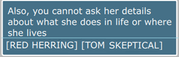
Would be bery cool if some tags would also have a boolean feature that would set a part of the GROUP title such as a location or Red Herring - Tom meets Bill
(Here it would be Red Herring) (just by a dropdown list, rather than typing)
(Another boolean checkbox would define if it only adds a part or several parts of the title or the full title)
(If it defines a part of the title, we could have different short value lists for the first part, 2nd, 3rd (They could be empty value, for less than 3 parts)
ex:
aaa - bbb - ccc - Arrival
aaa - bbb - Arrival
aaa - Arrival
Arrival
By extension, another possibility could to use BLOCK title to add several tags, such as:
INT - Restaurant - Day - Tom meets Bill for first time
(From slug line) (The automated addition would be "INT - Restaurant - Day - ")
Where tags impact Group or block titles, we could define the text that is added to the title:
Selecting the tag would add/remove appropriate elements in the title: no need to type many times the same thing in many places. We would only need to select the tag.
Lanes are really used for story lines.