Feature request/suggestion: New beat color management, Beat Necessity Level AND Subtext Display

So far:
Beat color can only display one color, although it might have several tags attached to it.
Among several tags, only one is displayed.

Bottom line: a color for a specific tag will not display everywhere it is,
such as in places it is not the first one for those beats
(This is, then, a false impression: not a full view for that tag!)

I think beat color cannot be defined by tags (Only one color, multiple tags!)

My first suggestion is this (Followed by an alternate/complementary option):

Each tag category could be a continuum of values (levels) in a specific order (cardinal, ordinal, call it the way you want),
Such as (example of my main concern: Beat necessity in the story), suc as:


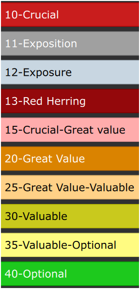
(To me: Exposition is the first appearance of context about where, or other elements of context, etc., while Exposure is showing what the character does in a possibly repeated way: A cook, a mother, a street beger, a lawyer, a farmer, etc., whe he shows his craft to the audience, of course, idally while something occurs in the story plot, but a beat might only show the craft)

Mainly: Crucial, Great Value, Valuable, Optional and intermediary levels.
Here, I put 10 different values, but I could put any value between 10 and 40, suc as 11,13, but here, values from 14 to 19 would be of same color as 15 (Because we already have 3 special cases 11,12,13), 21 to 29 same as 25 (An in between zone), etc. for middle values between 10 and 20, 20 and 30,30 and 40. In between beats - such as level 25 - would be candidates for the next higher level: 20-Great Value, but not yer officially of that level.

For each numeric value (1 to 50), we could assign a color and a text descriptor.
That way, we could display one category at a time on the whole timeline that could use the same color palette (Such as red, orange, yellow, green, although, for other categories, green could be assigned to most positive things, down to red for the worst assigned to lower or higher value, according to your preferences), but over different categories of different value (level) systems.

Once people experimented with the feature, we could share our setups, so that a default “standard” can be used, so people use the roughly same conventions for same categories (ex. 1 to 10 no 10 to 1, for what category, which color palette, etc.)

The main idea here is that not too many colors would be displayed for many matters. We could reuse same colors for different categories. Maybe in some cases, we could use another color like blue, white, pink, gray, etc.. But anyway, the red, orange, yellow & green could be used for many different catégories, we just need to know (select) which category we display (from a visible clue in the UI and rapidly selectable buttons)

We could then use less number of colors in a meaningful color system, for MANY MORE elements. Each category displayed ONE category at a time. (From an always visible screen selector, maybe also with a toggle between actual and previous)

We could assign either value by buttons (Best? : a floating tool pallet, or a non floating pallet at the top OR keyboard shortcuts OR for 15: typing CTRL+1+5) or a dropdown menu (No need - like a tag - to add the value every time we select it and have to remove the previous one, for changing the value from one to another, because they are of the same category and function like radio buttons).

For counting value such as total story time, we would not need to filter on these (Filters might be processor intensive, if keeps many beats, from my past experience),
We could be able to – on demand – display a report of lengths according to each actual level of inclusion:
-Including 10-Crucial only
-Including Crucial & Great Value
-Including Crucial, Great Value & Valuable
-Including Crucial, Great Value, Valuable & Optional

More precisely: In fact, it could be totals for these levels (Such as in my case with assigned values from 10 to 40):
10 : Total duration time
10 to 11: Total duration time
10 to 12: Total duration time
10 to 13: Total duration time
10 to 14: Total duration time

10 to 40:

We could see what is possible: the shortest version to the longest version, by selecting the cutoff level, seeing all possibilitées, without filtering many possibilities back and forth!.

The author would know all possible version lengths in one single report
AND be able to show what is added or removed from version to version!!!

It could be totaled for each Chapter/Episode and full total.
Of course NECESSITY is a special case: not all categories would need such duration report.

When we export, we could filter on the specific level of NECESSITY:
Ex.: We want: 15 and billow? (Or other range type for another category system, such as from 15 to all above)

**

My second suggestion (Alternate or complementary option for displaying many tags, more than what actually can be displayed through beat color)

:**

If beats can only display ONE color, and the more sophisticated suggestion above is not implemented, I suggest that beat color would only serve ONE purpose, such as the one I suggested above. The user could (Alternatively) define what it is about (If about something else than NECESSITY), by labelling the different numeric values, maybe only from 1 to 5.

Then, all tags would be displayed in the beat, billow the title, such as

IMAGE
(As new user I cannot post a 2nd image, see my 2 next posts for images)
See image in the image 1 post

OR in a sepcial area detached from the title area:

IMAGE
(As new user I cannot post a 2nd image, see my 2 next posts for images)
See image in the image 2 post

In Beat Editor, we should be able to write any subtext or element of concern that could help position the beat, review, rewrite, to be improved, not yet, written, Sad, Tom not trusting, A ful explanation of the beat in the the sequence or scene, but by not describing the action, rather giving other indications, etc.

Could be nice to choose subtext display color/bold, per word basis, such as in a text editor. We could then adapt or evolve our preferences, as well keep low color display.

Up to users to decide what color mixture amount is not too much like a Christmas tree.

Once an element is not anymore a concern for that beat, we could hide its subtext, or remove colors from several parts of the text.

A great aspect of this suggestion is that it does not add new things around the beat box:
It uses the inner title or the rectangle that is already of variable height for including the whole title. The main idea is to see in a beat 2 thing:
-Events (Action or dialogues abstract)
-Subtext, concerns about the beat, elements that could help find the best order for inserting it (so, its relationship with other beats, not only about what occurs in the beat)

So, would it be good to have a beat color system that:

-Could display only one category at a time (Value levels, continuum) (only ONE category where values are mutually exclusing: not possible or necessary to display more than one value at a time)?
OR
-Only meant for ONE category, such as NECESSITY,
AND everything else displayed on the beat (At the end of the title OR in an area billow it)?

Please, comment, ask clarification or mention if you think it would be value-creating in your writing process, pitches, directing, producing, etc.

I can’t wait for your POV.

Thanks

Marc

It’s interesting reading your post.

I admit to not understanding a lot of it. You work at a different level of beat management.

Unfortunately, Causality users don’t say much about what they do with tags. It would be useful to hear details from others.

When I moved from Final Draft to Causality, I started using tags for storylines. Wrote three scripts that way. Seemed useful.

But, in my world storylines track characters, so tags were actually redundant, and I don’t use tags anymore.

In the whiteboard I color beats by character. That works well for me. A slight problem being when characters or storylines cross - I can’t see two colors at the same time. Multicolor would be nice - as you mention.

The idea of “necessity” of a beat is new to me. If a beat isn’t crucial, should it even be in the script?

Thanks Carlo for your reply.

To me, the main flaw of beat color is - indeed - that it can only display one color at a time and the fact that all tags might influence the color, but in fact only the first tag, makes inconsistent color: Ex: a specific color might be 2nd or 5th in a beat, so, it will not display: you won’t see it. Thus, you cannot be certain you have a complete overview for a specific color. Of course, it implies as well that you cannot at all see the color of all other tags other than the 1st one in beat’s tag list.

Conclusion: Unless we can select what kind of aspect we aim at displaying the color gradiant of that aspect, just one aspect at a time, we cannot couple beat color with tags and all tags of a beat could only be used in UI zones (graphs), not the white board.

Sounds weird to me you use color for characters, since most beats would involve at least 2 characters. The top zone of the UI allows seeing all characters of a beat. The white board should be about story structure.

My main concern - for my actual project - is necessity, because I have more content than necessary for filling the time, but all are valuable. I aim at a 3h version and an extended 25-30 hour version of the same story, not even counting a possible printed novel version.

I need to track what needs to be in the 3h version and I might need to compromise for fitting within that length, even at beat level in a scene. (This project is mainly not about action, but about philosophic conversations/reflexions). Crucial level of necessity is about the main plot storyline (Events), then, other levels allow to have a color clue for later choices difficult to make.

Necessity is just an exemple of how beat color continuum could be used. One could use the same color scheme for another aspect or several in parallel, if we could select what aspect we want to explore, using the same color sheme, but for different purposes, such as Green, yellow, orange, red for from high to low, low to high, etc. Example: How the character feels: Refusal, doubts, open to try, functions, well, start believing, deep faith on what he does, etc.
or Indifferent, appreciates, feels feelings, in love, etc. OR untrust to trust

My other concern is about different notes - such as subtexts about the beat - for more easily choosing where and in which order to put the different beats, such as if he’s in doubts, notes to remember some aspects of the beat.

Comments welcome about if you think it would be a value-creating feature.

Marc

Hi Marc,

Yes, it sounds like you have a very complex project if it can span 3 to 30 hours. For a project like that, I’d fire up a database. That way you can tag multiple dimensions/contexts. It would be too complicated to manage otherwise.

When I mentioned color for characters, that’s because in the TV world, characters arcs are story structure. A typical TV episode will have 2-4 storylines, and there’s usually a single character driving each storyline.

Of course, there are some exceptions, like “world events” that might affect all characters. But, those are pretty rare.

Hi,

Nobody disagrees that showing one color either for a tag or a character doesn’t paint enough of a picture of what’s going on. The problem is what to do. While I appreciate the effort put into the suggestion (the suggestion has also been made offline), it has some critical flaws.

The dealbreaker is human mental bandwidth. We’ve of course tried all these ideas as the very first thing. We’ve tried having multiple bands of colors, gradient, bands, snips, you name it. I have a whole folder of Photoshop mockups. None of it works.

All UI mockups look good on paper, so you go ahead and build the feature, and find out that it actually sucks when you use it in real-time. In real life, you’re moving around quickly, and suddenly, the thing that looked great when you had 10 minutes to think about it doesn’t work when you have 0.5 seconds to think about it.

All of these color bands just become confetti. If everything has a color, then nothing has a color. You cannot process this amount of information in real-time. Especially not if you’re color blind, so we’re now creating fundamental UI that 1/5 of the users can never use.

This feature would be for one user, possibly zero users, while making the app even more complex for everyone else (our #1 user complaint). We’re just not being realistic about human cognition. I know you say that you can process this information, but I’m asserting that you can’t, and that no human brain can. We’re up against natural limits.

The only version of this that I believe in is badges. Whereas color perception is very weak, shape perception is very strong. We have dramatically more brain volume allocated to detecting shapes than colors.

If tags had icons, and those icons were printed as a little row of icons, you could easily pick out a “skull” icon or a “happy” icon, even as the whiteboard is scrolling by. Try doing that with one shade of purple over another shade of purple in a sea of colored dots.

We even already have an icon row in the beats, which was meant for another feature that never materialized. So we have a place to put it.

The way to validate this idea would be to simply paste some emojis into beat titles. If anybody is in the mood, put some emojis into some text editor next to the app, and then paste them in. If you have a “John Is A Rebel” storyline, paste a motorcycle emoji into the beat title of every beat in this storyline. Do that for every storyline to get a realistic picture of what this looks like at scale.

My bet is that this will scale. You’d be able to see motorcycle icons at a glance in a sea of other icons, and quickly find the beat you’re looking for.

I’d love to see that version of the idea validated.

Yes, in most software, super-special features go unused by 99% of users.

In my case, I think Causality blocks can solve some of the beat management problems.

But, to make this work well, it would be great to be able to “disable and hide” an entire block to keep them out of the timeline/script. Otherwise, I have to shove them off the end of the episode. (as mentioned in an earlier topic)

Bottom line, for not having too many colors at the same time, it makes sense having a color scheme, usable for several aspects, but one aspect displayed at a time.

A color scheme being, for a specific aspect, like radio buttons behaviour (when you select one, it de-selects the previous one, because only one value is possible at the same time.

We would just need to select which specific aspect we want to display, thus shifting to a specific color meaning set.

I think it is the most powerful way to manage the single color for beats.

My example of Necessity levels had one more aspect: counting duration from top critical to including each range level, ex: 1 to 2, 1 to 3, 1 to 4, …
After all, we might generate many ideas - more than necessary - and have to select the most important ones, without removing from the whiteboard options left aside, if they are already well positionned. Also, these days, we might manage more than one project of the same “franchise”.

Research folders can hold ideas, while the whiteboard can show them in a timeline and more 2D structure (A more mental image/vision).

Hi Carlo,

I don’t disagree with “too much information” in general, but we may be talking about different things.

In this case, we’re talking about what the cognitive load is on displaying many dimensions at the same time, and how much load a person can take. Right now we show one dimension, the first tag or character, which is not enough to understand one’s own story, yet we’re already at about maximum of what you can process as colors.

So the search is about how to show more dimensions without frying the pre-frontal cortex.

Hi Marc,

That’s actually very close to another idea that I believe in a lot.

Philosophically, you can show more dimensions the following two ways:

1.) Show all of them on screen at the same time, i.e. more colors, more icons etc., until the brain explodes.

2.) Explore by probing, meaning that you have some kind of panel where you turn things on and off, and the display shows that dimension.

Probing is how we understand our world. Pick up any object, and you don’t take all of it in. You turn it around, look at it from the back, from the side etc, and your brain forms a hologram of it.

Now for specifics:

The idea was to have a permanent tag panel on the side of the whiteboard which makes it extremely easy to probe tags. Then by default, you only select one tag at a time, so it’s like radio buttons. That allows you to quickly explore the many dimensions of the story, which will then hopefully form an intuition about how all of it fits together.

And then you could still be allowed to shift-click tags to view multiple at the same time.

Now that we have tag categories, this would actually be a small tree, not just a long list of tags.

This is a very clean and universal idea. And it seems like it would handsomely fit with your workflow, because your sub-tags are really just more tags. You could have a tag category called “Necessities”, and have Necessity tags under that. Then you can probe just your Necessities, and perhaps AND or OR them with your regular tags.

But the idea of a continuum of values for a specific aspect, is the fact that when one would select a value, it would discard the previous selected one, like going from Crucial to valuable to optional, back to valuable, etc.

So, in your tag tree, we should be able to activate Exclusive for a node, so that in every sub elements of that node, only one can be selected at a time, so that when we select one, any other previously activated would be removed from the beat.

As you consider the idea of a toggle pad for show/hide, all tags under the same exclusive node would be activated/deactivated as show/hide at the same time, because they are of exclusive use, only one at a time is tag for the beat it is for.

Bottom line: tag color is useful if it can diplay one or more colors that are of exclusive use. Thus, the idea of selecting one color/tag continuum for only one aspect, or one aspect at a time.

Reminder: this system would allow using the same color pallet for many aspects. We just need to know which one it shows. That’s why an always visible tag pad would be useful: to fast intepret what we see. (Eliminating the Christmas tree effect)

Example of element I appreciate keeping track of: Red Herring. Some beats include an element for protecting the non-obviousness of something the will later be devealed.
The beat might look not so necessary or action backed, but is still an investment.
It won’t appear in many beats, but I don’t want to discard a beat that includes a red herring, without being aware of that.

A cool aspect of an icon system is that we don’t need to take care of some aspects in the beat COLOR system (Ex. Read Herring), and we won’t lose the non-displayed info, because beat only have one color actually used for something else!

I think that for displaying other aspects beyond the one setting the beat color, we need to rely on icons that could be of specific shape, color and maybe a centered label (a 2 capital letters, which might be 2 digits) in the middle of the icon, ex for helping interpret the icon or making difference between characters (Ex mood or presence, same icon, but different letters or digits for the character).

For such system, we would need to set if a specific tag functions on either the tag color OR icons system. But icons as well could gain from the Exclusive behaviour and tag tree. However, it might be necessary to process in separate way icons pertaining to a different character or other kind of instances that can be multiple. Ex.: mood for char 1, mood for char 2, each one using a similar icon system for mood, but are in fact 2 different tags, because about two different characters. Either the system can process such multiple case, or it could be to the user to build and add to a tag tree new nodes, such as when adding characters in the tag system.

About my concept of Necessity, the main idea was to be able to associate tags with a value, even, beside lets say 5 tags, we could fine tune with a value in between two tags. We could then have a duration report from including only what is Crucial or widen the selection. But ideally, not having to go back-forth selecting value ranges and see total duration, we could see all possibilities in a report.

Other use case for the same feature: Duration of what remains to be revied, rewritten, structure discussion to have, technical discussion to have, OK, approved, etc. with a report showing both duration and estimated time of work to go. Another aspect on the same system, could be different rough total $ estimates (depending on duration, location, challenges, etc.). We could put a value in the beat->reports would show total according to different inclusion levels, from Necessity levels. (Here it is just an example of ossible use of several levels.

Hi,

I’m still deeply against this. It’s too many dimensions, and it takes the worst part of Causality and makes it worse. All feedback shows that we’re already slicing story along so many dimensions that it’s paralyzing, especially for new users, and this is the #1 reason given when we interview people who have canceled.

Add to this, that the feature springs from one person’s deeply personal system. I appreciate that you’re trying to find other uses for the idea, but this doesn’t make it a general idea.

Good user interface REDUCES dimensions, the same way you control 80 dimensions in your car’s engine with 5 dimensions in the driver’s seat. If someone had the idea to add more knobs that you have to turn, the car manufacturer should fight it tooth and nail, because they make the car harder for everyone else. They’d make one person happy for every 100 customers they lose.

It can’t simply be brushed off with “people don’t have to use it”, because the feature is sitting there in the UI making noise and making people feel that they OUGHT to understand it. This is already our main problem. We have way too many parameters and unfamiliar concepts, and many people struggle to get into the app because there are too many choices to make.

We pop the champagne when we find ways to remove things by unifying features. This is the opposite of that.

You’ll have to find a way to do your work with the existing system.

Thanks for your reply, but here are some points (The bottom line abstract of the topic):

  1. The actual beat color system is inconsistent (So, somehow useless and confusing), because it can only show one tag as a beat color, while there are many tags on the beat. This means beat color should show one continuum of values for one aspect, and only one - at least at a time.

  2. Users should be able to adapt to their preferences and needs, and we might expect the way they use the tool will evolve, according to both their needs and experience with the tool.

  3. The main difference between Causality and other scriptwriting softwares is the visual aspect.

  4. One might be interested in tracking 2 aspects (Not many). But in the actual system, 2 is already too many. The tag system is only meant for search and graphs, but NOT beat color (Because of previously mentionned reasons)

  5. I depicted a consistent solution:

  • A specific tag is displayed either as an icon OR a tag color (Exclusive OR, only one option)

  • If it is a displayed as a beat color, it is meant to be displayed as part of a two color system (a binary display such as: red or gray, for yes or no, about a specific aspect or day/nignt or any other aspect, present or not)

  • OR as part of a multi-value continuum for ONE aspect (Such as necessity or mood of character A, of character B, etc. The main PROBLEM is that beat colors can only display one aspect, at least at a time.

  • Up to user’s necessity, the user could setup a color continuum scheme for different aspects, but display only one aspect at a time, reducing the many color number displayed at the same) time, because using the same color scheme, for different aspects, BUT only one aspect displayed at a time.

  1. If the user wants to keep it simple, it can be done. At least any wanted aspect can be shown on the aspect of beat color, but not at the same time.

  2. If the user want to keep visual track of something, such as Red herrings or To be written or rewritten, 1st reviewed, 2nd reviewed, 3rd reviewed, etc., an icon could do it.

  3. The advantage of an icon is that it could be continuously displayed (Without regards to the actual beat color aspect displayed), or hidden as wanted. Users could then select how many or which icons are displayed.

  4. Imagine we limit the options to 3 icons and one color scheme: icons would take care of what beat color would not need to.

  5. Necessity level is a special case for managing different versions and know what length each one is. Beat colors would help select what should be added or taken out of a specific level.

Hi,

But, honestly, it’s fantasy that people can understand this many dimensions. Yes, showing just one color for a beat is probably not enough information, but it’s a huge leap to just throw everything at the wall, multi-colored beats, gradients, icons, you name it. You insist that you can understand it, and I insist that it’s a total illusion, no human brain can get anything meaningful out of it. This feature will be just as useless to you in the real world as it will be to others.

This feature suggestion is very bad, for reasons that I don’t want to keep restating. Added to that, it would cost a lot of money to implement, and a lot of money to remove again, while making our worst problems worse, as even seasoned storytellers struggle to figure out how to take any first step in the app. I wouldn’t even know how to explain the feature to anyone.

I’m sorry, but I’m denying this suggestion. This is a wrong feature.

Per

Per,

In a visual software, users should be able to display what is important to them.

  1. Very simple to explain and show, in a visual way.

  2. I never said to throw everything at once on the board.

The main idea is the opposite: users could decide what they want to see, one thing at a time (For/and through beat coloring)

The point was also that what works for one gradient about one thing like Necessity or critical level, could be used for other things, using the same few colors.

  1. If icons are too complex to add to beats, another possibility could be to be able to highlight words in the beat title (Not only select word color, but background color. Ex: a word could be highlighted white on red, eventhough they are not connected to a tags)

  2. Remains the idea to visually manage different numbers of beats included, depending on different target lengths, with possible length report for different beat number inclusions.

  3. I gave several useful use cases for icons.